Configure display options
Use this guide when users need control over table presentation without exposing every internal table setting.
The goal is to decide which layout controls belong in your product, make those controls easy to find, and keep column visibility, frozen columns, and ordering feedback consistent.
Start by deciding how much presentation control users really need
Display options are best for choices that help users work faster without changing the underlying data query:
- which columns are visible
- how many columns stay frozen on the left
- whether ordering feedback should stay visible
- whether headers or grid lines should be shown
- whether empty groups should appear when grouping is active
If a control would confuse most users or break a product convention, hide it instead of exposing it just because the component supports it.
Turn on the toolbar entry point
The display-options button lives in the toolbar.
<Datatable
  tableKey="customers"
  data={customers}
  columns={columns}
  getRowId={(row) => row.id}
  toolbar={{
    displayOptions: true,
  }}
/>
If your toolbar is enabled, this button is part of the right-side control cluster alongside views and copy-link actions.
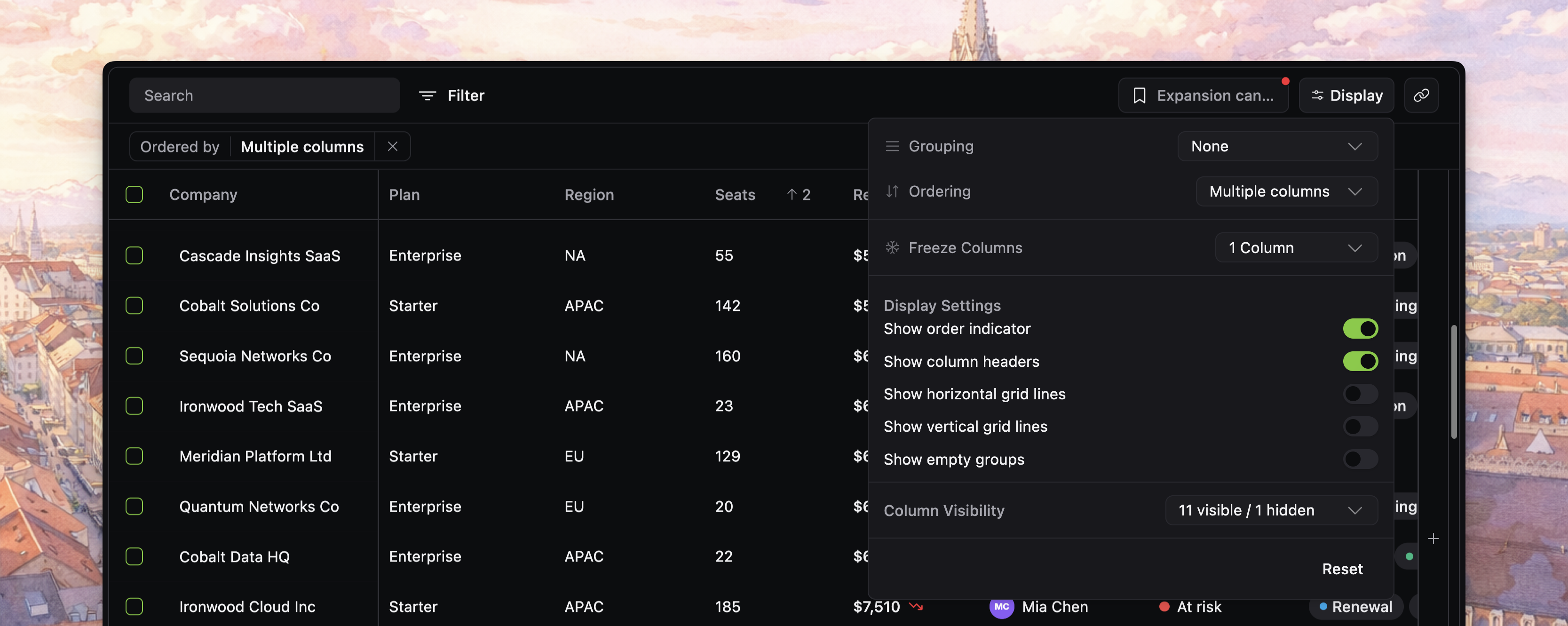
Shape the popover around the controls users actually need
Use the top-level displayOptions config to decide which sections appear inside the popover.
<Datatable
  tableKey="customers"
  data={customers}
  columns={columns}
  getRowId={(row) => row.id}
  toolbar={{
    displayOptions: true,
  }}
  displayOptions={{
    sections: {
      // whether to show a specific section
      grouping: false,
      ordering: true,
      freezeColumns: true,
      displaySettings: true,
      columnVisibility: true,
    },
    controls: {
      // whether to show specific controls within sections
      showEmptyGroups: false,
      showOrderingBadge: true,
    },
  }}
/>
That split is important:
toolbar.displayOptionsdecides whether the button exists- top-level
displayOptionsdecides what the popover contains
Keep the display-options scope focused on presentation
The current popover groups controls into a few jobs:
- grouping and ordering controls near the top
- frozen-column control
- display settings toggles
- column visibility management
- a reset action at the bottom
Decide whether users should manage ordering here
The popover includes an ordering section, but it is best for simple primary-sort selection.
Use it when users need to:
- pick the main sorted column
- flip ascending versus descending
- clear sorting quickly
If users need deeper multi-sort management, the applied sorting chip remains the clearer surface today because it exposes the full sort stack and drag-to-reorder behavior.
Use display settings to control how much state stays visible
The display settings section currently exposes toggles for:
- show order indicator
- show column headers
- show horizontal grid lines
- show vertical grid lines
- show empty groups
showOrderingBadge is especially useful when you want sorting to remain active but not always visible in the applied-state bar.
That gives you a clean split:
- sorting logic can stay active
- the chip row can stay quieter when the order is just a product default
Choose the right column visibility UI mode
columnVisibilityUI controls how users manage visible versus hidden columns.
"badges": best for smaller sets where drag-and-drop chips stay readable"dropdown": best for larger sets where search matters more than spatial scanning"auto": let the source switch based on hideable column count
<Datatable
  tableKey="customers"
  data={customers}
  columns={columns}
  getRowId={(row) => row.id}
  columnVisibilityUI="dropdown"
  toolbar={{
    displayOptions: true,
  }}
/>
In badge mode, users can both toggle visibility and reorder visible versus hidden columns directly in the popover.
[!NOTE] Screenshot placeholder: badge-style column visibility UI with visible and hidden columns separated clearly, including drag-and-drop reordering chips.
Add the quick column picker when visibility changes are frequent
The toolbar popover is not the only visibility entry point.
viewColumnsButton adds the + button pinned at the right edge of the grid for fast column toggles close to the table itself.
<Datatable
  tableKey="customers"
  data={customers}
  columns={columns}
  getRowId={(row) => row.id}
  viewColumnsButton={{
    show: true,
  }}
/>
Use this when people often adjust visible columns while scanning the table, not only from the toolbar.
[!NOTE] Screenshot placeholder: auxiliary
+view-columns button pinned at the right edge of the grid, showing a faster in-table visibility control than the main toolbar popover.
Let users keep layout changes across sessions
If users change these table settings, you can keep those choices across sessions with current-view persistence or saved views.
That is especially useful for column visibility and ordering indicators, which are often part of how users recognize their working view.
Verify display options before you move on
Before you continue, confirm that:
- the display-options button appears where users expect it in the toolbar
- the popover includes only the sections your product wants to expose
showOrderingBadgematches whether sorting should stay visibly user-controlled- the chosen
columnVisibilityUIfits your column count - frequently changed layouts are backed by persistence or saved views