Table anatomy
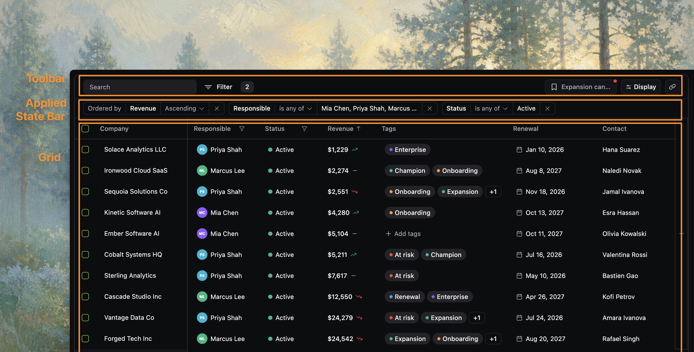
This page names the main parts of a react-datatable table: the toolbar, applied state bar, grid, preview panel, bulk actions, and footer. Use it when you want to point at a specific part of the table without having to say "that thing above the rows" or "the menu near the right edge."
How the table is put together
In the source, DatatableBody brings the visible table regions together:
- the toolbar
- the applied state bar
- the grid itself
- optional visibility and bulk-selection affordances
- optional preview and pagination surfaces
Those pieces work as one table, but each part has its own job. Naming them makes product discussions clearer: "change the toolbar" means something different from "change the applied state bar" or "change the grid."
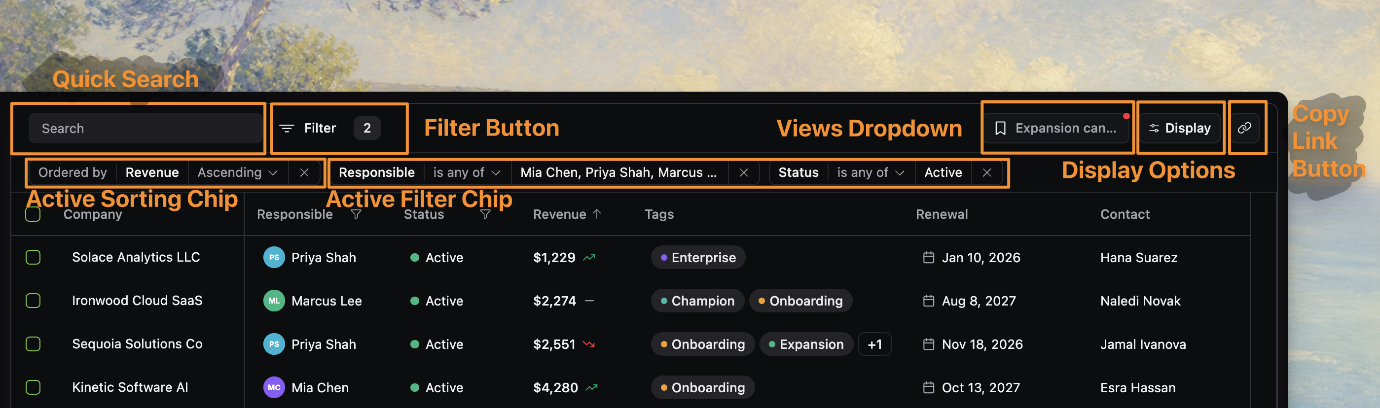
1. Toolbar
The toolbar is the top control row rendered by DatatableToolbar. It gives users a place to start table-wide changes before they enter the grid itself.
Depending on configuration, the toolbar can include:
- Quick search for global text search
- Filter button for column-filter workflows
- Views dropdown for saved views
- Display options button for presentation controls
- Copy link for sharing the current table state
On narrower layouts, the same controls wrap into multiple rows, but they are still the same toolbar region.
2. Applied state bar
Directly under the toolbar, DatatableAppliedStateBar renders the applied state bar. This region shows the state that is currently affecting the result set or presentation, especially:
- active filters
- active sorting chips when ordering badges are visible
This matters because react-datatable separates choosing state from seeing what state is active. A user may open filtering from the toolbar, apply several filters, and then manage or clear those filters from the applied state bar. That makes the bar part of the table's visible feedback loop.
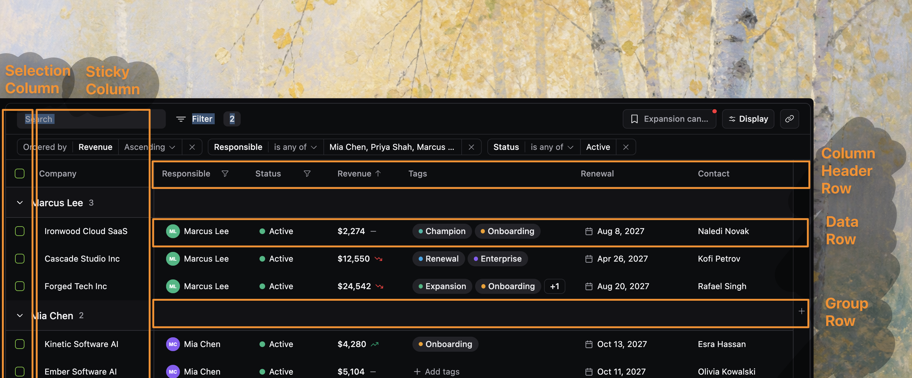
3. Grid
The grid is the main scrolling table region rendered through VirtualizedGrid. This is where users read rows, compare values, sort from headers, resize columns, navigate with the keyboard, and interact with grouped or selected rows.
The grid region includes several important sub-areas:
- Column headers for labels, sort affordances, and resize handles
- Data rows for the primary record surface
- Group rows when grouping is active
- Selection column when row selection is enabled
- Sticky or frozen columns when left columns stay pinned during scroll
The grid is the central region of the product, with support behaviors living around it.
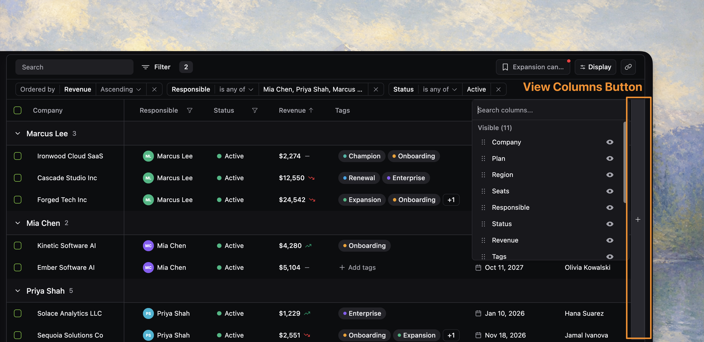
4. View-columns button
When enabled, the view-columns button is the + control pinned near the right edge of the grid. It is a fast column-visibility affordance for people who are already working inside the table and want to change visible columns without reopening the toolbar flow.
Treat it as a companion to display options, not a separate visibility system.
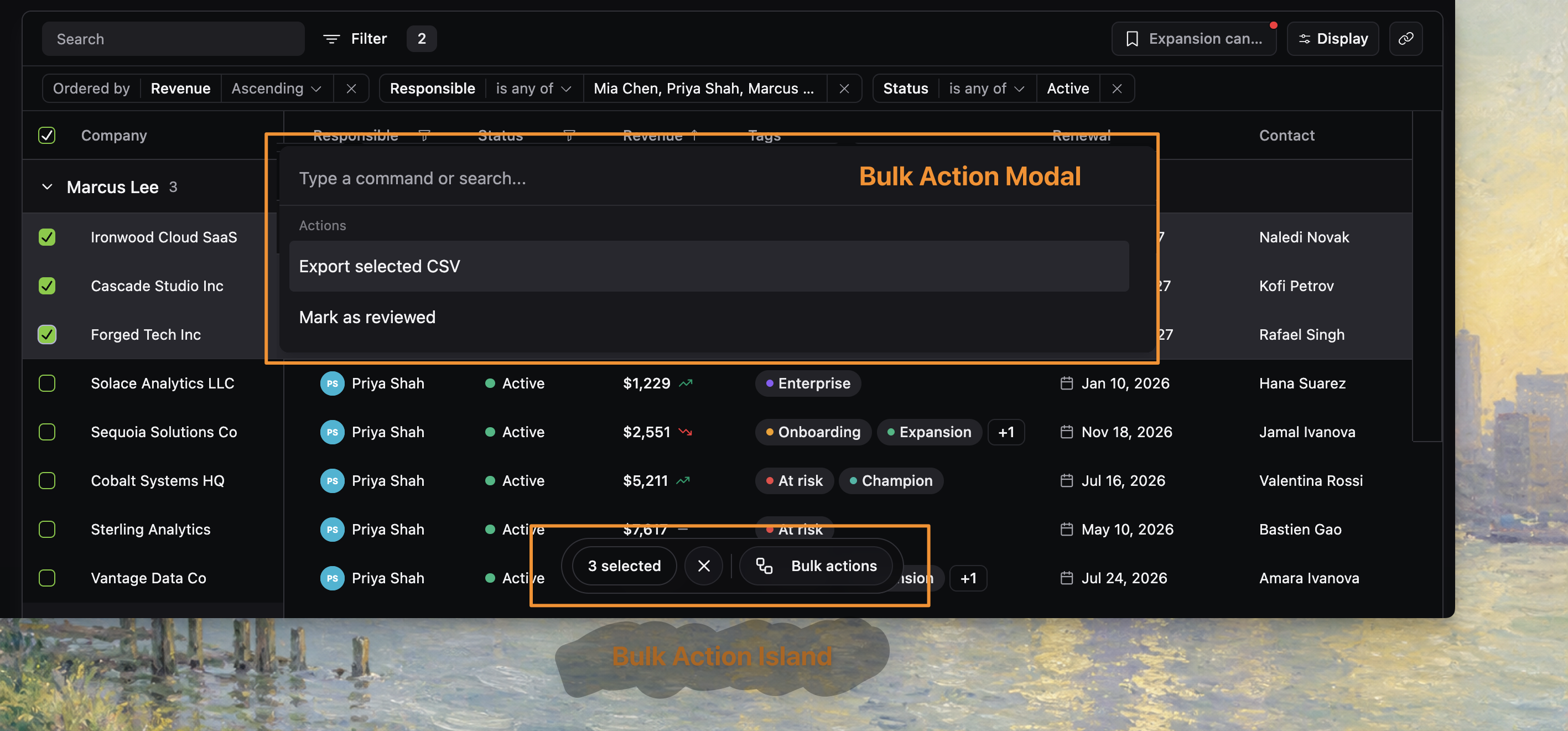
5. Bulk action island
When selection is enabled and rows are selected, BulkActionIsland appears above the table content. This region has one job: turn selection into action.
It typically shows:
- the selected count
- a clear-selection action
- the trigger that opens the bulk action dialog
The island only appears when it is relevant. That makes it a contextual surface rather than a permanent part of the layout.
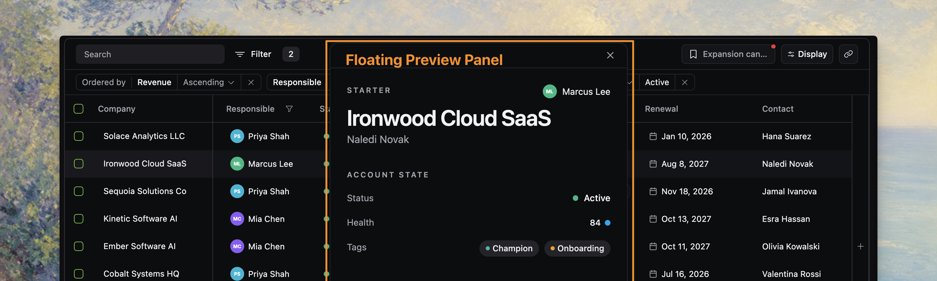
6. Floating preview panel
When row preview is enabled and open, FloatingPreview renders a floating panel above the main table layout. This region is for lightweight inspection without leaving the current table context.
A few anatomy details matter here:
- it is an overlay, not part of the grid flow
- it can persist position in session storage when configured with a table key
- it is separate from row selection and separate from full row navigation
That separation is useful language during product work: "open the preview" means something different from "select the row" or "open the record page."
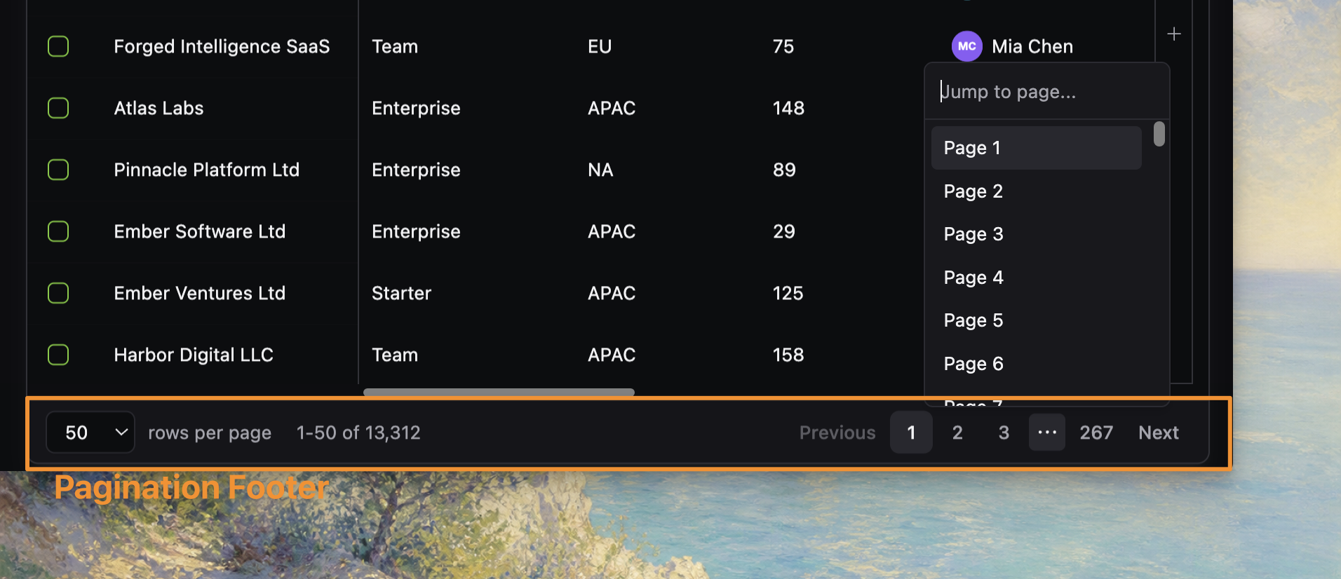
7. Pagination footer or loading footer
In online pagination mode, the footer below the grid becomes the pagination surface. This region includes:
- page-size selection
- current range summary
- previous and next controls
- direct page navigation
In other data modes, the lower edge of the table may instead express loading, empty, or virtual scrolling behavior. The important anatomy idea is that navigation and result-range feedback live below the grid, not inside the toolbar.
How these regions work together
A typical workflow crosses several regions:
- start in the toolbar with search, filters, views, or display options
- confirm active state in the applied state bar
- inspect or manipulate rows in the grid
- branch into contextual regions like bulk actions, preview, or pagination when needed
That flow is why the docs treat react-datatable as one coordinated table surface rather than a standalone grid plus unrelated extras.
Where to go next
- For row ownership and server-backed tables, read Data loading.
- For first-render state precedence, read State Lifecycle.
- For implementation detail on a specific region, continue into the relevant Guides pages such as Add global search, Configure display options, Add row selection, or Add row preview.