Add column ordering
Use this guide when users need to reshape the table around their workflow without changing the underlying column definitions.
The goal is to expose drag behavior where it helps, keep sticky-column rules understandable, and make reordered layouts persist instead of snapping back on the next visit.
Start with stable column IDs and a sensible default order
Column ordering depends on durable column IDs.
Before you expose drag-and-drop, make sure:
- every user-visible column has a stable
id - the initial
columnsarray already reflects a sensible default order - identity columns stay near the left edge unless users have a strong reason to move them
Column ordering works best when users are refining a good default, not rescuing a bad one.
Enable column reordering explicitly
Use the columnReordering prop to opt into drag behavior.
<Datatable
  tableKey="customers"
  data={customers}
  columns={columns}
  getRowId={(row) => row.id}
  columnReordering={{
    allowFrozenBoundaryCrossing: false,
    widthMorph: "interpolate",
  }}
/>
This enables header drag reordering for visible columns while keeping the rest of the table contract unchanged.
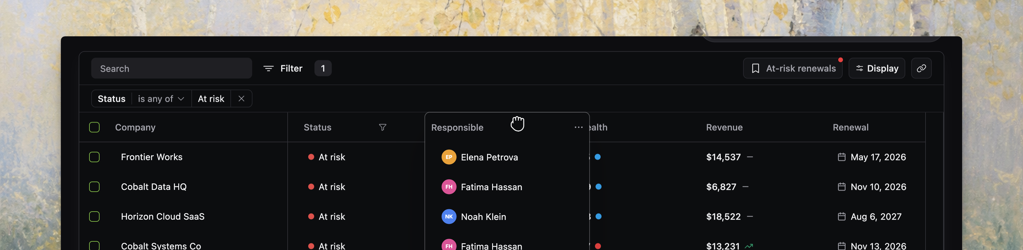
[!NOTE] Screenshot placeholder: column reorder via drag-and-drop plus column visibility and ordering controls in one realistic product table.
Decide whether frozen columns form a fixed left-side zone
allowFrozenBoundaryCrossing controls whether dragged columns can cross the sticky/non-sticky boundary.
false: frozen columns stay in the frozen zone and non-frozen columns stay in the scrollable zonetrue: users can drag visible columns across that seam
Use false when frozen columns represent a product-level identity area, such as:
- company or customer name
- issue title
- selection checkboxes
- row actions
Use true only when users genuinely expect full freedom over the left edge of the table.
The current drag controller actively clamps drop targets to the allowed side when boundary crossing is disabled, so this is a real interaction rule, not only a recommendation.
Pick the width-morph behavior intentionally
widthMorph controls how the dragged header overlay reacts when it moves over columns with different widths.
"none": keep the original width while dragging"snap": jump to the target width"interpolate": animate between source and target widths
<Datatable
  tableKey="customers"
  data={customers}
  columns={columns}
  getRowId={(row) => row.id}
  columnReordering={{
    widthMorph: "snap",
  }}
/>
If you want the drag preview to feel more polished, set this explicitly. The copied source currently falls back to "none" in the grid controller unless you provide a value.
Keep column ordering aligned with visibility controls
Column ordering only affects visible columns during drag.
That matters in two places:
- header drag reorders the visible grid columns
- badge-based column visibility management can also reorder visible versus hidden columns inside display options
Because hidden columns keep their relative positions in the stored order, users get more predictable results when you treat visibility and ordering as one layout story.
A good pattern is:
- use display options for visibility changes
- use header drag for fast spatial rearrangement
- persist both together as part of the current view
Keep sticky columns conservative
Frozen columns are useful, but too many make drag behavior harder to understand and reduce horizontal space.
The current source caps sticky columns to preserve layout quality, so treat the left frozen zone as a small identity area rather than a second full table.
That usually means freezing only the columns users need for context while scanning wide datasets.
Persist reordered layouts
Column ordering becomes much more useful when it survives refreshes, navigation, and shared working modes.
Pair reordering with:
- current-view persistence for per-user defaults
- saved views when teams need named layouts
- URL sync only when layout state should travel in a shared link
<Datatable
  tableKey="customers"
  data={customers}
  columns={columns}
  getRowId={(row) => row.id}
  persistState={{
    adapter: localStorageAdapter,
  }}
  columnReordering={{
    allowFrozenBoundaryCrossing: false,
    widthMorph: "interpolate",
  }}
/>
Without persistence, column drag often feels like a temporary toy instead of a serious workflow tool.
Reset order through state, not ad hoc DOM tricks
To restore the default layout, reset the stored table state or load a saved/default view with the desired columnOrder.
Avoid trying to patch the visual order outside the datatable state model. Ordering, visibility, sticky columns, and widths already interact inside the shared state surface.
Verify column ordering before you move on
Before you continue, confirm that:
- visible columns drag into the expected positions
- frozen-column boundaries behave the way your product intends
- the chosen
widthMorphfeels right for mixed column widths - visibility changes and ordering changes stay coherent together
- reordered layouts survive through persistence or saved views when they should