Add global search
Use this guide when users need one fast search box before they reach for column-specific filters.
The goal is to turn on quick search, keep the matching surface relevant, and make sure search runs in the right place for the data mode you already chose.
The search box can look similar in local and online mode. The important difference is where matching actually happens.
Turn on the search box
Turn on the built-in search box from toolbar.quickSearch.
<Datatable
  tableKey="customers"
  columns={columns}
  data={customers}
  getRowId={(row) => row.id}
  toolbar={{
    quickSearch: {
      placeholder: "Search customers...",
      debounceMs: 300,
    },
  }}
/>
The toolbar renders the search input on the left side of the table UI and keeps the current search term in datatable state.
Choose the fields users actually think in
Global search works best when it matches the fields users expect to search quickly:
- company, person, issue, or project names
- obvious IDs or short codes
- status-like labels when users commonly search by them
It works poorly when every technical or noisy field is searchable by default.
Exclude noisy columns
The current source honors column-level enableGlobalFilter, so disable global search on fields that should not match the quick search box.
export const customerColumns: DatatableColumn<Customer>[] = [
  {
    id: "company",
    accessorKey: "company",
    header: "Company",
    filterType: "text",
  },
  {
    id: "internalNotes",
    accessorKey: "internalNotes",
    header: "Notes",
    enableGlobalFilter: false,
    enableSorting: false,
  },
]
This is the safest way to keep quick search focused without changing how column filters work.
Use the placeholder to set expectations
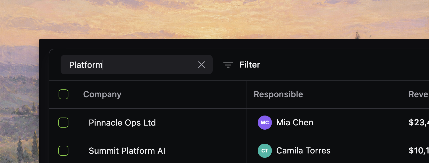
If users are unsure what the box searches, make the placeholder explicit.
toolbar={{
  quickSearch: {
    placeholder: "Search company, owner, or status...",
  },
}}
A good placeholder reduces ambiguity without adding extra explanatory UI.
[!NOTE] Screenshot placeholder: search box with explicit placeholder text like “Search company, owner, or status...” visible over a realistic table so the expectation-setting language is easy to judge.
Change debounce only if you need to
debounceMs controls how long the input waits before updating table state.
toolbar={{
  quickSearch: {
    placeholder: "Search customers...",
    debounceMs: 200,
  },
}}
Keep the default unless you have a reason to change it:
- lower values feel more immediate on small local tables
- slightly higher values can reduce server churn in online mode
Do not treat debounce as the main performance strategy. Pick the right data mode first.
Search scope is controlled by columns and backend logic
There is no separate toolbar setting for narrowing quick-search matching.
Today, the real control points are:
- disable global search on noisy columns with
enableGlobalFilter: false - choose the right backend search fields in online mode
- use placeholder text to set user expectations
That is simpler and more honest than suggesting there is a second search-scope config in the toolbar.
Keyboard shortcuts work out of the box
The quick search input already supports a few useful shortcuts:
Cmd+ForCtrl+Ffocuses the table search inputEscapeclears the current value and blurs the input when it is focused
That makes quick search feel like a first-class table control instead of just another form field.
[!NOTE] Screenshot placeholder: quick search focused via keyboard shortcut, with the active input state and nearby filter controls visible to show the toolbar as a cohesive command surface.
In local mode, search only sees loaded rows
In local mode, the table checks the current search term against globally searchable columns in the loaded row set.
That means:
- search only sees rows already in memory
- disabling
enableGlobalFilteron a column removes it from quick-search matching - matching happens alongside the rest of the browser-side query pipeline
If users expect backend-authoritative search semantics, local mode is the wrong fit even if the UI looks convenient.
In online mode, your backend owns search
In online mode, the table sends the current search term to your query function as input.globalFilter.
async function fetchCustomers(input: OnlineQueryInput): Promise<OnlineQueryResponse<Customer>> {
  let query = db.select().from(customers)

  if (input.globalFilter.trim() !== "") {
    const term = `%${input.globalFilter.trim()}%`
    query = query.where(
      or(
        ilike(customers.company, term),
        ilike(customers.owner, term),
        ilike(customers.status, term)
      )
    )
  }

  return runQuery(query, input)
}
In this mode, your backend must decide:
- which fields are searchable
- how matching works
- whether search is case-insensitive, prefix-based, full-text, or fuzzy
- how totals, facets, and grouped output stay consistent with the filtered result
Check the no-results message
After search is enabled, verify that the no-results state tells users what to do next.
Good empty-state text usually tells them to:
- clear search
- remove or loosen filters
- confirm they are in the right saved view or scope
Verify the search behavior
Before you continue, confirm that:
- the search box appears where users expect it in the toolbar
- the placeholder describes the intended search surface
- noisy columns are excluded with
enableGlobalFilter: falsewhere needed - local mode only promises search over loaded rows
- online queries apply
input.globalFilterconsistently to rows, totals, and facets - the no-results state is understandable when search returns nothing